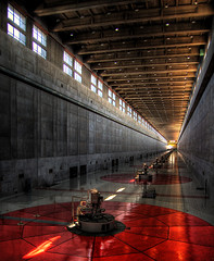
 At my sixth Christmas the stocking was full of - among other goodies - a lot of very sugary, sweet chocolate. Probably Hershey's Kisses, chocolate casts of Santa, gold coins, and the like. After all the gifts were unwrapped I set in on the chocolate. The first few pieces were delicious, and I was hooked. I kept eating until I was full, then until I was unwell, then until I was suddenly running to the bathroom as fast as I could to vomit it all back up again. HDR (High Dynamic Range) photographs have a lot in common with that sugary chocolate.
The first time I saw an HDR photograph was a few years ago when I happened upon some while searching for images of hydroelectric plants on Flickr. I had not seen anything quite like them before: there was a "hyper-real" quality to the images. The colors sang loudly, the contrast was bold, it looked tack sharp and there was detail everywhere. What a visual feast!
I had a similar experience the second time I saw an HDR photo. By the hundredth time, however, I was once again back at the Christmas chocolate orgy, stained and stuffed, and suddenly making a mad dash for the toilet. While there are fine examples of HDR photographs just like there are fine chocolates, the bad stuff is just so omnipresent and glaring.
To back up for a moment, the goal of HDR is to allow an image with a large dynamic range (difference between the darkest part and the brightest part) to exceed the usual limitations a camera has with such scenes and more closely approximate the way the eye sees them, thereby eliminating the blown highlights and burnt shadows in a photo of a scene where the eye could clearly discern these. The technique is normally accomplished by taking several photos (tripod recommended) at different exposures, and then using software to merge them together. As long as the technique is used in moderation by a photographer with a good eye, these can be incredibly effective. Google it if you want to learn more.
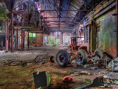
 The problem is when the technique is used to give an image that "HDR look", a result aimed to seduce the viewer in the most overly saccharine manner, like all the gritty sugar in those cheap Christmas chocolates. This happens either when photographers use any number of software tools designed to make HDR photographs without "tuning" the software for each image - or having seen and been themselves seduced by such images, seek to consciously emulate their novelty. The results are usually strange - typically oversaturated - colors, halos separating bright and dark zones, and occasionally inverted tones. The image above right, while initially seductive, ultimately looks like something Thomas Kinkade would paint if he took a break from cozy gnome cottages and ventured into industrial decay. While the marriage of industrial decay and Thomas Kinkade could be great social commentary: tying our culture of excess consumption and waste to sentiments of national decline embodied in a bygone industrial era through a kitschy critique of the fetishization of ruin, that's not what we get. Instead we are left simply with a picture trying too hard to be cool. It's neat, but it does not say much, and the same can be said of almost all good photographs with the "HDR look".
Technique and its misuse for artistic purposes is an old and broad subject. To keep close to the current topic one need only think about the misuse of lens tilt by artists like Olivo Barbieri to create images of fake miniatures, which has become quite a photographic fad - even inspiring products such as the Lensbaby. Unlike the fake miniature phenomenon, which began with the critical agenda of artists and later became the cool trick for anyone with an expensive lens or knowledge of photoshop, the HDR phenomenon seems largely to have come out of a popular aesthetic. To my knowledge no artists are critically engaged with it to create, for instance, that marriage of Thomas Kinkade and industrial decay. Instead the cool picture dominates the scene, and while some of the pictures are indeed pretty cool, they would be way cooler (and much richer) if they had some critical depth. Until this happens we are stuck with gorging ourselves on gritty sickly sweet pictures, and periodically sprinting for the bathroom.
No comments:
Post a Comment